Album digipak design ideas
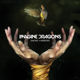
For my first idea I have been very inspired by the Imagine Dragons album cover for their smoke and mirrors album that I have analysed. I really like the idea of the hands and how they reach out to try to catch the bird. I have decided to incorporate this into my own idea but making the hands reach out to catch the toy car I have featured in my video. The hands that are reaching out will have blood on them as this captures the idea of being caught red handed and similar to a visual shown in my own music video. The car will represent the young boy (as he plays with that car) and his life, the hands trying to capture the car to stop it from falling represents the protagonist trying to so his life slipping and falling away, however, his hands are already covered with blood so there is nothing that he can do about his life as it has all gone. This is further shown by the fact that the image looks like the hands won't get to catch the car in time before it falls through the hands and even if they do the blood on the hands might make the car slip through them.

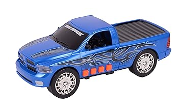
The toy car represents youth and innocence and the blue in contrast with the red represents the conflicting emotions that protagonist has. The blue represents sadness and the connotation of the dark blue of the car illustrates the seriousness of the situation. This in contrast to the red which represents the anger that the protagonist feels and the danger that is presented in the music video with the eventual death of the young boy.
For the inside of the case with the cd cover I'm thinking of keeping the the cover of the candle in one of the shots in and maybe using imagery of the eyes as a viewer or potential buyer or listener will feel more emotionally connected to the visuals if incorporate eyes. This is because people are able to connect to others better and get a sense of them as a person by looking into others eyes. This in addition makes for very iconic imagery, also the use of eyes makes people think of souls, as eyes are the windows to the soul, will work with my theme of death in my digipak well.

I will mostly stick to dark colours with the addition to some light colours to draw peoples attention to some certain parts of the digipack that are important. This will stick to my horror/thriller themed music video and song that is displayed clearly throughout my project.
The toy car represents youth and innocence and the blue in contrast with the red represents the conflicting emotions that protagonist has. The blue represents sadness and the connotation of the dark blue of the car illustrates the seriousness of the situation. This in contrast to the red which represents the anger that the protagonist feels and the danger that is presented in the music video with the eventual death of the young boy.
For the inside of the case with the cd cover I'm thinking of keeping the the cover of the candle in one of the shots in and maybe using imagery of the eyes as a viewer or potential buyer or listener will feel more emotionally connected to the visuals if incorporate eyes. This is because people are able to connect to others better and get a sense of them as a person by looking into others eyes. This in addition makes for very iconic imagery, also the use of eyes makes people think of souls, as eyes are the windows to the soul, will work with my theme of death in my digipak well.
I will mostly stick to dark colours with the addition to some light colours to draw peoples attention to some certain parts of the digipack that are important. This will stick to my horror/thriller themed music video and song that is displayed clearly throughout my project.


Comments
Post a Comment